The Anatomy of a Great Home Page
Your homepage is not the place to be mysterious, artsy, or vague.
It has one job, help the right people quickly understand who you are, what you do, and what to do next. If someone lands on your site and has to work to figure that out, they won’t. They’ll leave.
A good homepage feels obvious in the best way. Clear. Calm. Trustworthy.
Like, “Oh. Yes. This makes sense.”
Here’s what actually needs to be on a homepage, and why it works.
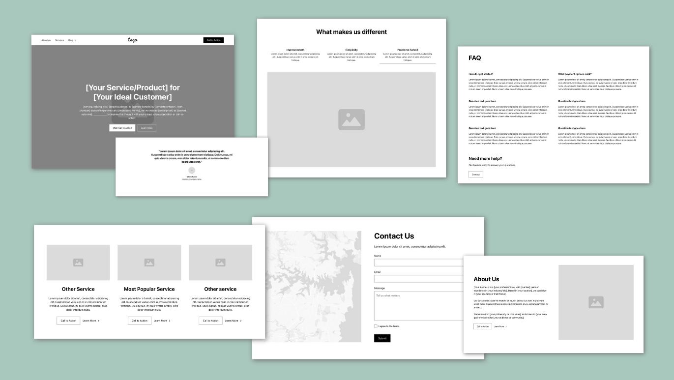
1. The Hero Section
The hero section is the top part of your homepage, the first thing people see when your site loads. Its job is to quickly explain who you are, what you do, who it’s for, and what to do next. If that’s not clear within a few seconds, people won’t keep scrolling. This is the most important part of your entire website.
Before someone scrolls, clicks, or reads anything else, they should immediately know:
- Who you are
- What you do
- Who you do it for
- What action they should take
That’s it.
What works best here
- A photo of a real human, preferably you or a real client, not a stock photo of people high-fiving
- A clear headline that says what problem you solve
- A short supporting sentence that adds context
- One primary call to action
You can also include a short paragraph explaining why you’re the right one to solve their problem, but keep it concise.
If someone can’t explain what you do after five seconds on your homepage, the hero section isn’t doing its job.
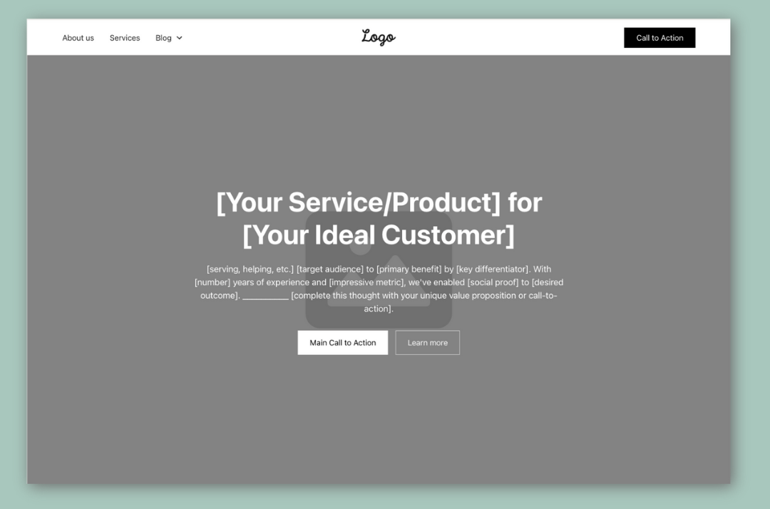
2. Social Proof (AKA Testimonials or Logos)
People trust other people more than they trust you talking about yourself.
Social proof can look like:
- Testimonials
- Client logos
- Short quotes
- Impressive stats
- Certifications and affiliations (BBB, associations, licenses)
This section answers the unspoken question:
“Has this worked for anyone else?”
You don’t need to put the entire review here, just the most impactful parts and be sure to correct any grammar or spelling mistakes.
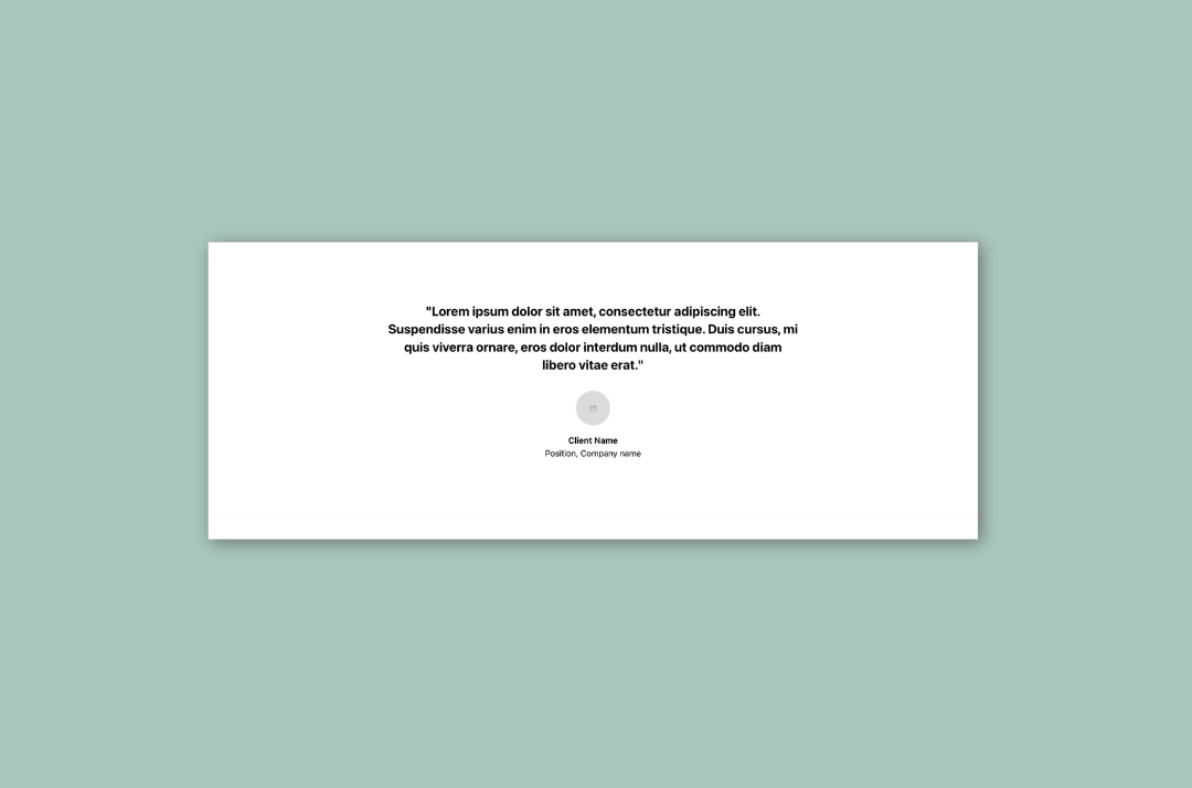
3. Benefits
Sometimes this comes before services. Sometimes after. Either way, benefits matter. This is where you translate what you do into what it means for them.
Not:“I offer specific service.”
But you will experience:
- Less confusion
- Clear next steps
- Problems solved
Benefits help people emotionally understand why they should keep reading.
4. Services
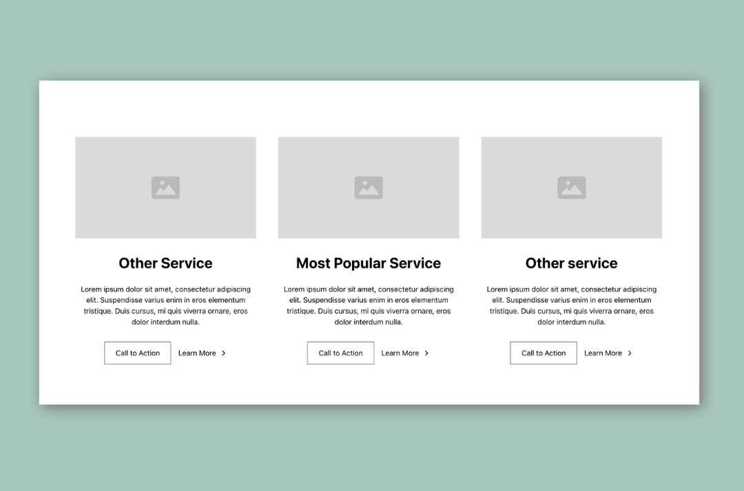
Once people feel oriented and reassured, they’re ready to see what you actually offer.
This section should be:
- Simple
- Skimmable
- Focused on clarity, not clever names
You’re not trying to impress here. You’re trying to help someone say, “Yes, that’s what I need.”
5. A Short About Section
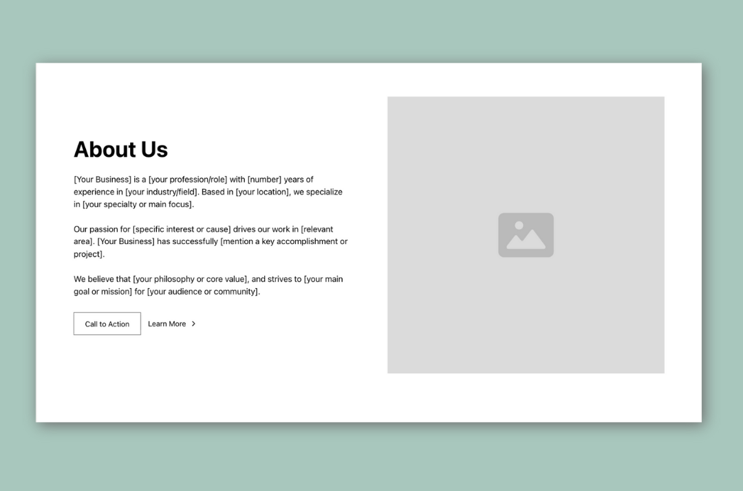
This is not your full About page. This is the “why you” moment.
Answer questions like:
- Why do you do this work?
- How do you approach it differently?
- What makes you a good fit for the kind of clients you want?
This builds connection without overwhelming people. Think credibility plus personality, not autobiography.
6. Call to Action
By now, someone should be warming up.
They understand what you do.
They trust you more.
They see themselves in the problem.
All you need to do now is tell them what to do next. A clear invitation guides them to take action instead of click away.
7. FAQs
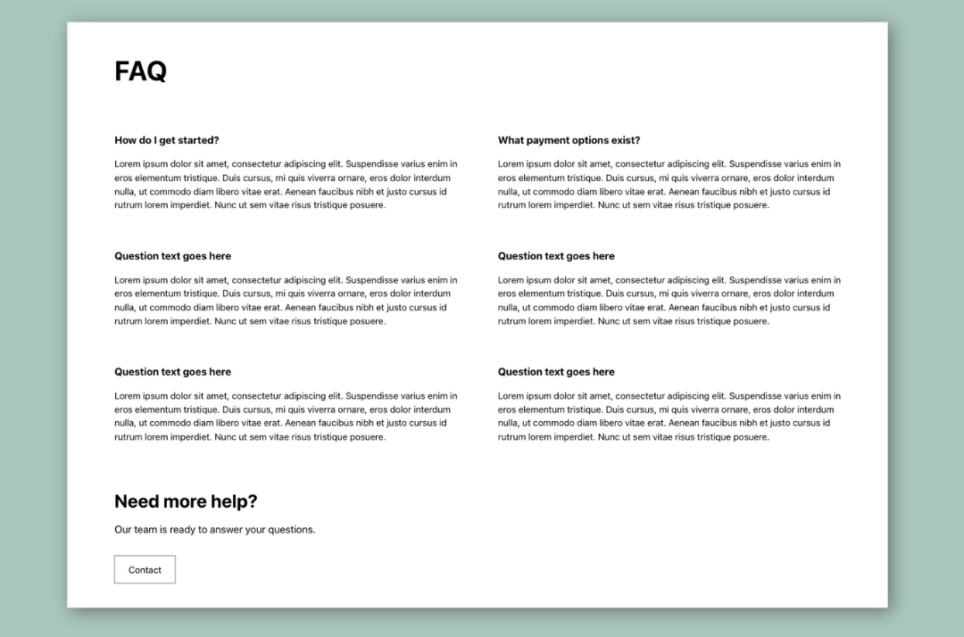
FAQs are great conversion machines and a great place for additional keywords you are trying to rank for.
They remove hesitation by answering:
- How long does this take?
- What does it cost?
- Is this right for someone like me?
If someone is already interested, FAQs often tip them into action.
8. Final Call to Action or Contact Section
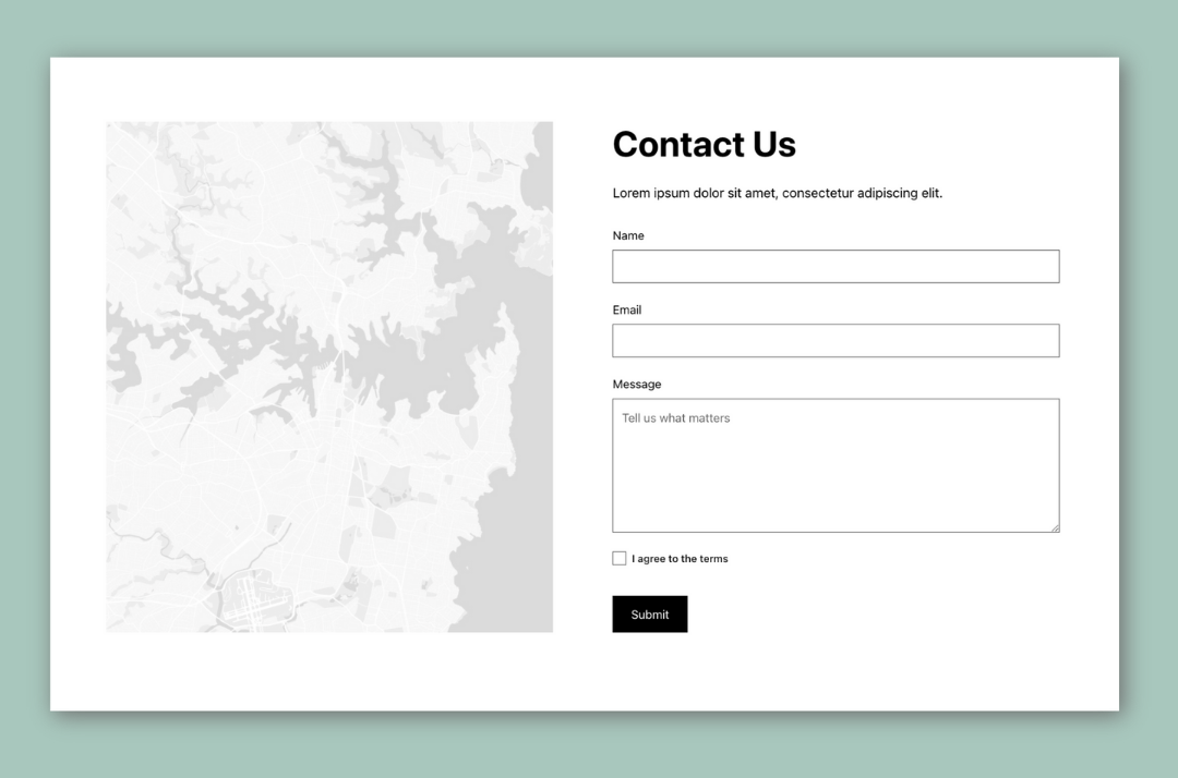
Your contact form should be a simple form with as few fields as possible
9. Optional Extras
- Blog previews
- Instagram feed
- Featured Portfolios
- Additional Testimonial Sections
- Pain-Point Solution Section
These support trust and depth, but they should never distract from your main goal.
10. The Footer
Even your footer matters.
At a minimum, it should include:
- Contact info
- Navigation
- A final nudge toward your main call to action
Think of it as a safety net for people who scroll all the way down looking for something specific.
TLDR: The Big Picture
A good homepage doesn’t try to do everything.
It guides.
It reassures.
It makes the next step obvious.
Clear beats clever every time.
And when your homepage is built this way, your website stops feeling like a digital business card and starts pulling its weight.
If you want help figuring out whether your homepage is doing this well, or fixing the parts that aren’t, that’s literally my thing.